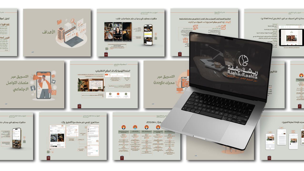
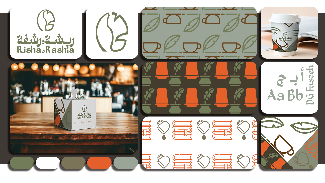
The visual identity of the Risha & Rashfa project represents a set of cohesive visual elements that reflect the essence and goals of the café as a peaceful study space combining coffee and knowledge.
This identity was crafted using warm, natural colors and symbolic visuals inspired by reading, writing, and relaxation, offering a unique design language that mirrors the spirit of the space.
This identity was crafted using warm, natural colors and symbolic visuals inspired by reading, writing, and relaxation, offering a unique design language that mirrors the spirit of the space.
What does the visual identity include?
Logo:
The logo embodies a philosophy of balance between creativity and relaxation. It consists of a visual blend of a feather (thought, study) and a coffee bean (alertness, comfort).
The wordmark uses the Arabic font “Faseh” with size modifications for readability and visual harmony, reinforcing the café’s image as a cultural and academic brand.
The wordmark uses the Arabic font “Faseh” with size modifications for readability and visual harmony, reinforcing the café’s image as a cultural and academic brand.
Colors:
The main color palette includes:
Olive green: for balance and nature.
Brown: representing warmth and coffee.
Gray: for simplicity and calm.
Secondary colors enhance contrast and visual flexibility while preserving the identity’s consistency.
Typography:
The identity relies on a single Arabic typeface, “Faseh”, known for its clarity and elegance.
A matching Latin typeface was selected to maintain harmony across bilingual applications.
A matching Latin typeface was selected to maintain harmony across bilingual applications.
Icons & Patterns:
Six custom icons were designed to represent the café’s themes: feather, books, coffee bean, cup, heart, and coffee drop.
These icons are used to build decorative patterns in various color options, adding a unique touch to packaging, prints, and interior visuals.
These icons are used to build decorative patterns in various color options, adding a unique touch to packaging, prints, and interior visuals.
Applications:
The visual identity is applied across several key mediums:
Business card
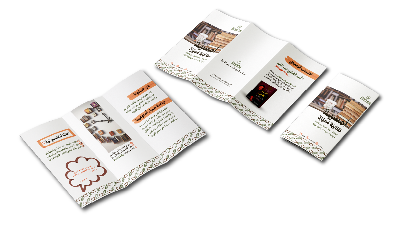
Brochure
Poster
Social media posts
Calendar
Food packaging
Paper cups
Co-branding usage guidelines
الهوية البصرية لمشروع ريشة ورشفة تمثل مجموعة من العناصر المتكاملة التي تعبّر عن جوهر المشروع وأهدافه كمقهى دراسي يجمع بين القهوة والعلم في بيئة هادئة وملهمة.
تم تصميم الهوية باستخدام ألوان دافئة وطبيعية، مع مزج عناصر بصرية مستوحاة من القراءة، الكتابة، والاسترخاء، لتقديم تجربة بصرية فريدة تنسجم مع روح المكان.
تم تصميم الهوية باستخدام ألوان دافئة وطبيعية، مع مزج عناصر بصرية مستوحاة من القراءة، الكتابة، والاسترخاء، لتقديم تجربة بصرية فريدة تنسجم مع روح المكان.
ما الذي تشمل الهوية البصرية؟
الشعار:
الشعار يعكس فلسفة تجمع بين الإبداع والراحة، حيث تتكوّن العلامة من دمج بصري بين ريشة ترمز إلى الفكر والدراسة، وحبّة بن ترمز إلى اليقظة والاسترخاء.
تم استخدام خط "فصيح" في كتابة اسم "ريشة ورشفة" بطريقة معدّلة لضمان وضوح القراءة وجمال المظهر، ما يعزز من حضور العلامة في ذهن العميل كمقهى ثقافي دراسي.
تم استخدام خط "فصيح" في كتابة اسم "ريشة ورشفة" بطريقة معدّلة لضمان وضوح القراءة وجمال المظهر، ما يعزز من حضور العلامة في ذهن العميل كمقهى ثقافي دراسي.
الألوان:
تم اختيار الألوان الأساسية بدقة لتعكس جوهر المشروع:
الأخضر الزيتي: يشير إلى التوازن والطبيعة.
البني: يرمز إلى القهوة والدفء.
الرمادي: يضيف لمسة من الهدوء والبساطة.
كما أضيفت ألوان ثانوية لزيادة المرونة في التطبيقات وتعزيز التباين البصري، مع الحفاظ على الانسجام العام للهوية.
الخطوط:
اعتمدت الهوية على خط عربي واحد وهو "فصيح"، لقدرته على تحقيق وضوح بصري وجمالية متناسقة في العناوين والنصوص.
أما في الاستخدام اللاتيني، تم اختيار خط متوافق بصريًا يُظهر التوازن بين اللغة العربية والإنجليزية دون الإخلال بالهوية.
أما في الاستخدام اللاتيني، تم اختيار خط متوافق بصريًا يُظهر التوازن بين اللغة العربية والإنجليزية دون الإخلال بالهوية.
الأيقونات والأنماط:
تضم الهوية البصرية ستة أيقونات مخصصة تعبّر عن نشاط المقهى: الريشة، الكتب، حبّة البن، فنجان، قلب، وقطرة قهوة.
تم استخدام هذه الأيقونات في تصميم أنماط زخرفية قابلة للتكرار بألوان مختلفة، ما يضيف طابعًا خاصًا للمطبوعات والتغليفات والعناصر الداخلية.
تم استخدام هذه الأيقونات في تصميم أنماط زخرفية قابلة للتكرار بألوان مختلفة، ما يضيف طابعًا خاصًا للمطبوعات والتغليفات والعناصر الداخلية.
التطبيقات:
شملت الهوية عدة تطبيقات رئيسية تدعم حضور العلامة التجارية بشكل متكامل:
بطاقة أعمال
مطوية دعائية
بوستر
منشورات منصات التواصل الاجتماعي
تقويم سنوي
تغليف خاص للطعام
أكواب ورقية
توجيهات لاستخدام الشعار مع علامات تجارية أخرى