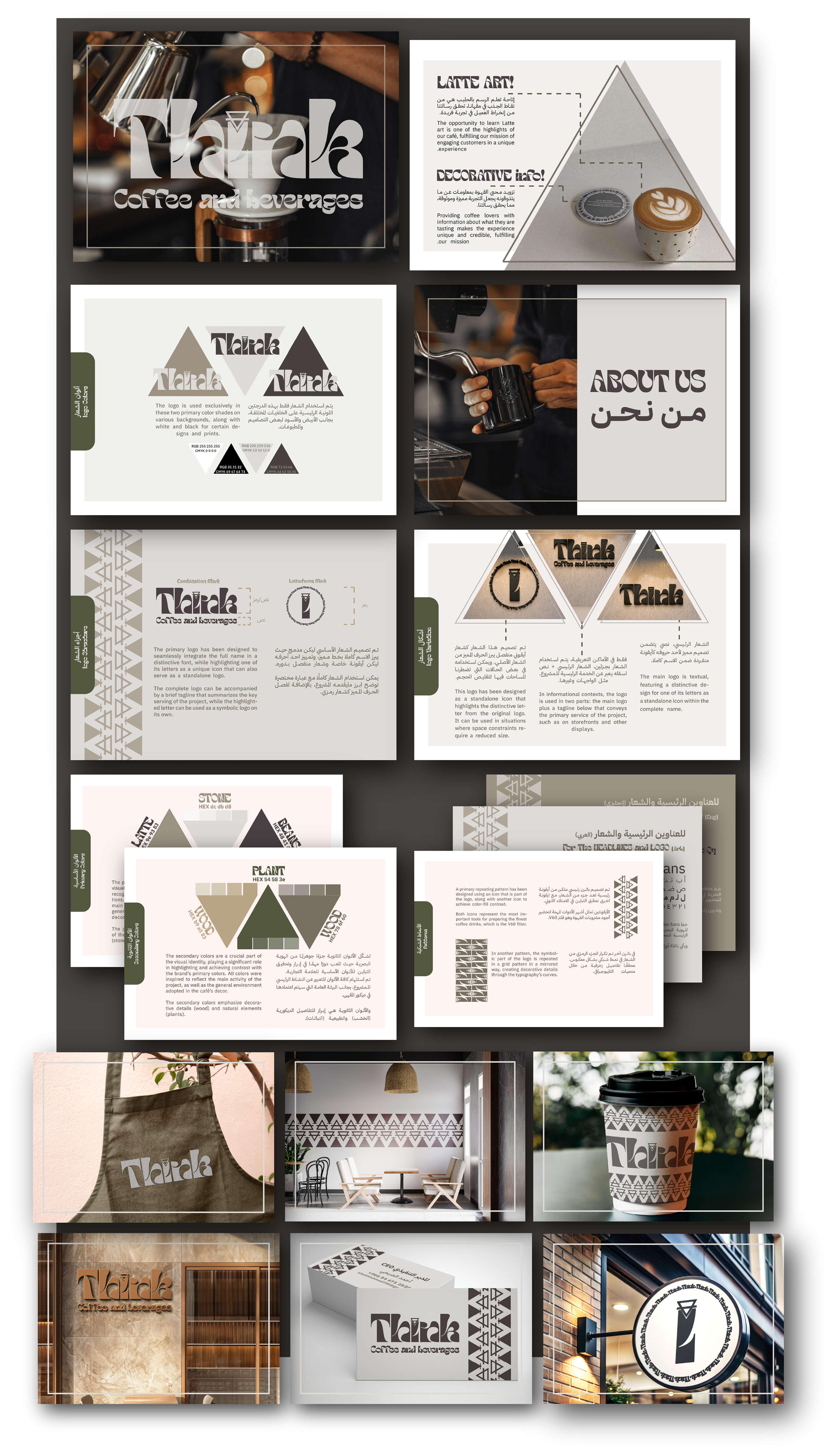
The visual identity of the "Think" café project represents an integrated collection of visual elements that capture the essence and goals of the café.
This identity is crafted using bold, earthy tones, paired with geometric forms that emphasize the central activity of coffee brewing. The focus is on craftsmanship, knowledge, and the cultural importance of coffee, aiming to create an inviting and educational space for coffee enthusiasts.
What does the visual identity include?
Logo:
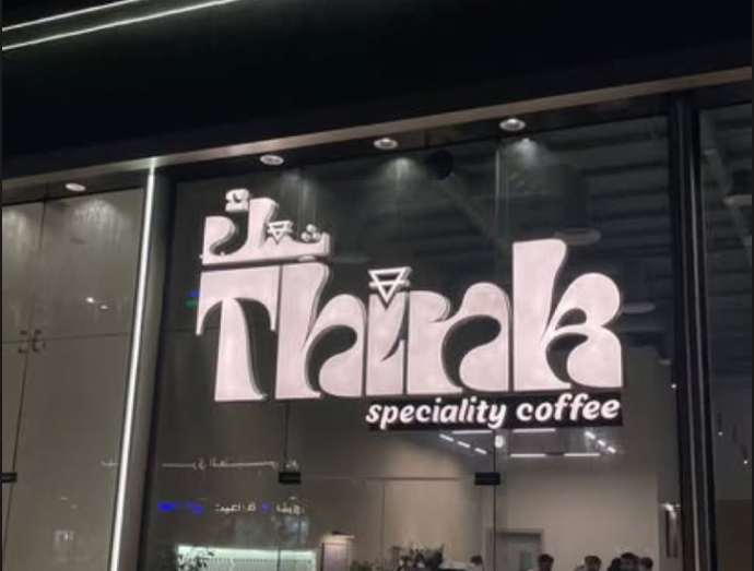
The logo integrates a distinct letter from the café's name with an icon inspired by one of the most popular coffee brewing tools, the V60 filter. This icon enhances the café’s message of encouraging customers to "Learn More" about their beverages. The logo reflects modernity and simplicity, aligning perfectly with the brand’s core values of professionalism and education.
Colors:
The primary colors include dark earthy tones like stone and bean latte, which represent the rich, grounded nature of coffee culture. Secondary colors such as wood and plant green reflect the café’s cozy, natural environment, reinforcing the theme of sustainability and connection to the earth.
These colors create a warm and inviting atmosphere while maintaining a clean, professional appearance that is suitable for both the café’s physical space and its digital presence.
Typography:
The typography uses Tobias for the English content and IBM Plex Sans for the Arabic content, creating a harmonious balance between the two languages. The fonts are modern and clean, allowing for easy readability and a professional aesthetic. The chosen fonts also convey the message of being approachable yet sophisticated.
Icons and Patterns:
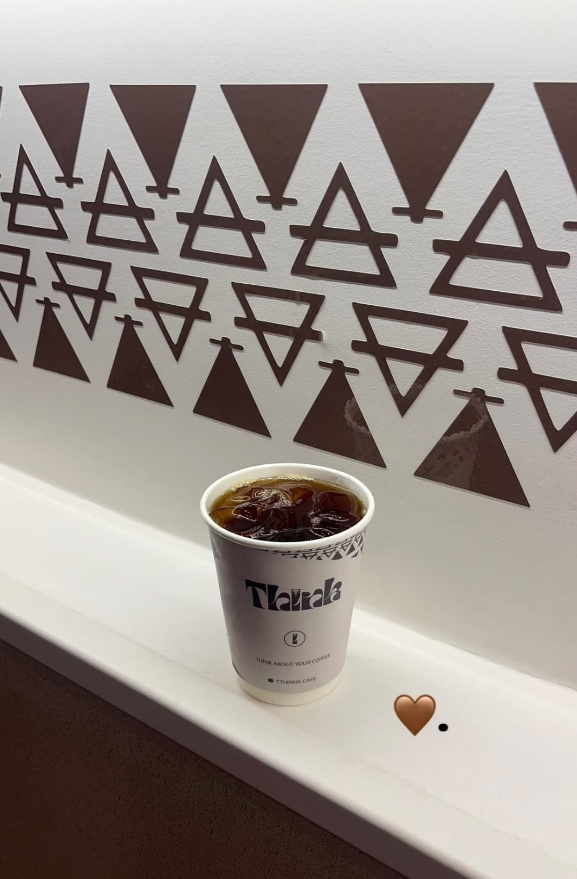
The identity features five key icons, which represent the core activities of the café, such as coffee preparation tools and the process of brewing. These icons can be used individually or in combination to create different visual patterns that further reinforce the brand.
Geometric patterns such as repeated coffee-related icons and symbolic parts of the logo are incorporated into the design to add decorative elements, making the environment both functional and visually appealing.
Images and Complementary Elements:
Images of the café environment, coffee tools, and customer engagement are used to align with the visual identity. The design elements are also reflected in the café’s décor, helping to create a cohesive and immersive experience for customers.
The Identity Reflected by the "Think" Project:
Professionalism: The earthy color palette and clean typography reflect the café’s professional approach to serving high-quality, expertly brewed coffee, while also creating an atmosphere of learning and discovery.
Creativity and Education: The incorporation of brewing tools and the concept of "Learning More" reflects the café’s commitment to offering a unique educational experience, providing customers with insights into the art of coffee making.
Simplicity and Modernity: The clean lines, minimalist iconography, and modern font choices give the brand a contemporary, sleek appearance that appeals to a broad audience.
Sustainability: The secondary colors inspired by nature, such as wood and plant green, showcase the café’s commitment to environmental sustainability and provide a connection to the natural world.
Conclusion:
The visual identity of the "Think" project is a blend of modernity, simplicity, and creativity, making it ideal for a café that specializes in both the art of coffee and the education of its customers. This identity represents the project’s mission to offer high-quality coffee while enhancing the customer experience with learning opportunities, creating a strong and lasting connection between the café and its patrons.
الهوية البصرية لمشروع "ثنك" تمثل مجموعة من العناصر البصرية المتكاملة التي تعكس جوهر وأهداف المقهى.
تم تصميم هذه الهوية باستخدام ألوان دافئة وأرضية، إلى جانب أشكال هندسية تبرز الأداة الأساسية في تحضير القهوة. مع التركيز على الحرفية والمعرفة وأهمية القهوة الثقافية، تهدف الهوية إلى خلق بيئة تعليمية ودافئة لعشاق القهوة.
ما الذي تشمل الهوية البصرية؟
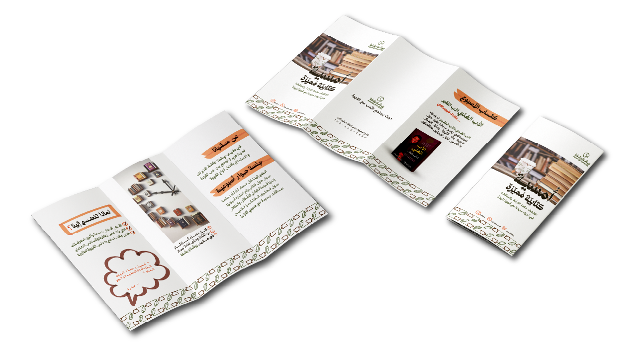
الشعار:
الشعار يتكون من حرف مميز من اسم المقهى مع أيقونة مستوحاة من أحد أدوات تحضير القهوة الشهيرة، مثل فلتر V60. هذه الأيقونة تعزز رسالة المقهى في تشجيع الزبائن على "التعلم أكثر" حول مشروباتهم. يعكس الشعار البساطة والحداثة، ويتماشى تمامًا مع القيم الأساسية للعلامة التجارية مثل الاحترافية والتعليم.
الألوان:
تم اختيار الألوان الأساسية مثل الظلال الأرضية الداكنة مثل الحجر و قهوة اللاتيه لتمثل الطبيعة الغنية والمتأصلة في ثقافة القهوة. بينما تعكس الألوان الفرعية مثل الخشب و اللون الأخضر النباتي بيئة المقهى الطبيعية والمريحة، مما يعزز من موضوع الاستدامة والاتصال بالأرض.
هذه الألوان تخلق جوًا دافئًا وترحيبيًا مع الحفاظ على مظهر احترافي يناسب كل من المساحة الفعلية للمقهى والحضور الرقمي للعلامة.
الخطوط:
يتم استخدام خط Tobias للمحتوى الإنجليزي و IBM Plex Sans للمحتوى العربي، مما يخلق توازنًا متناغمًا بين اللغتين. الخطوط حديثة وواضحة، مما يسمح بسهولة القراءة ويمنح المظهر العام للعلامة التجارية الاحترافية. كما أن الخطوط المختارة تعكس الرسالة في كون العلامة التجارية قريبة، ولكنها أنيقة.
الأيقونات والأنماط:
تتضمن الهوية البصرية خمسة أيقونات أساسية تمثل الأنشطة الرئيسية للمقهى مثل أدوات تحضير القهوة وعملية التخمير. يمكن استخدام هذه الأيقونات بشكل منفرد أو معًا لإنشاء أنماط بصرية مختلفة تعزز من العلامة التجارية.
الأنماط الهندسية مثل تكرار الأيقونات المرتبطة بالقهوة و الجزء الرمزي من الشعار مدمجة في التصميم لإضافة عناصر زخرفية، مما يجعل البيئة العملية جذابة بصريًا.
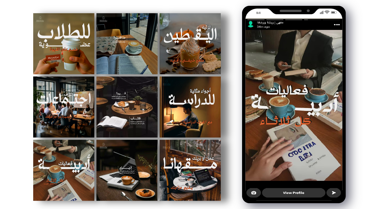
الصور والعناصر التكميلية:
يتم استخدام صور لبيئة المقهى وأدوات القهوة وتفاعل العملاء مع المنتجات لتعكس الهوية البصرية. كما تنعكس العناصر التصميمية في ديكورات المقهى، مما يخلق تجربة متكاملة ومتماشية مع الهوية.
الهوية التي يعكسها مشروع "ثنك":
الاحترافية: الألوان الأرضية والخطوط الواضحة تعكس نهج المقهى الاحترافي في تقديم قهوة عالية الجودة، مع خلق جو من التعلم والاكتشاف.
الإبداع والتعليم: دمج أدوات تحضير القهوة ومفهوم "التعلم أكثر" يعكس التزام المقهى بتقديم تجربة تعليمية فريدة لزبائنه حول فن تحضير القهوة.
البساطة والحداثة: الخطوط النظيفة والرمزية البسيطة والاختيارات الحديثة في الخطوط تعطي العلامة التجارية مظهرًا عصريًا، مما يجعلها جذابة للجميع.
الاستدامة: الألوان الفرعية المستوحاة من الطبيعة مثل الخشب والأخضر النباتي تعكس التوجه نحو الاستدامة واهتمام المقهى بالبيئة في تصميم منتجاته.
الخلاصة:
الهوية البصرية لمشروع "ثنك" هي مزيج من الحداثة، البساطة، والإبداع، مما يجعلها مثالية لمقهى يتخصص في تقديم القهوة وفن تحضيرها وتعليم العملاء. تمثل هذه الهوية قيمة المشروع في توفير قهوة عالية الجودة وتجربة تعليمية، مما يخلق رابطًا قويًا ومستدامًا بين المقهى وعملائه.