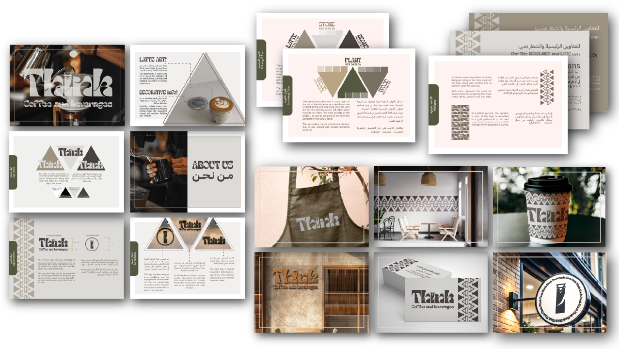
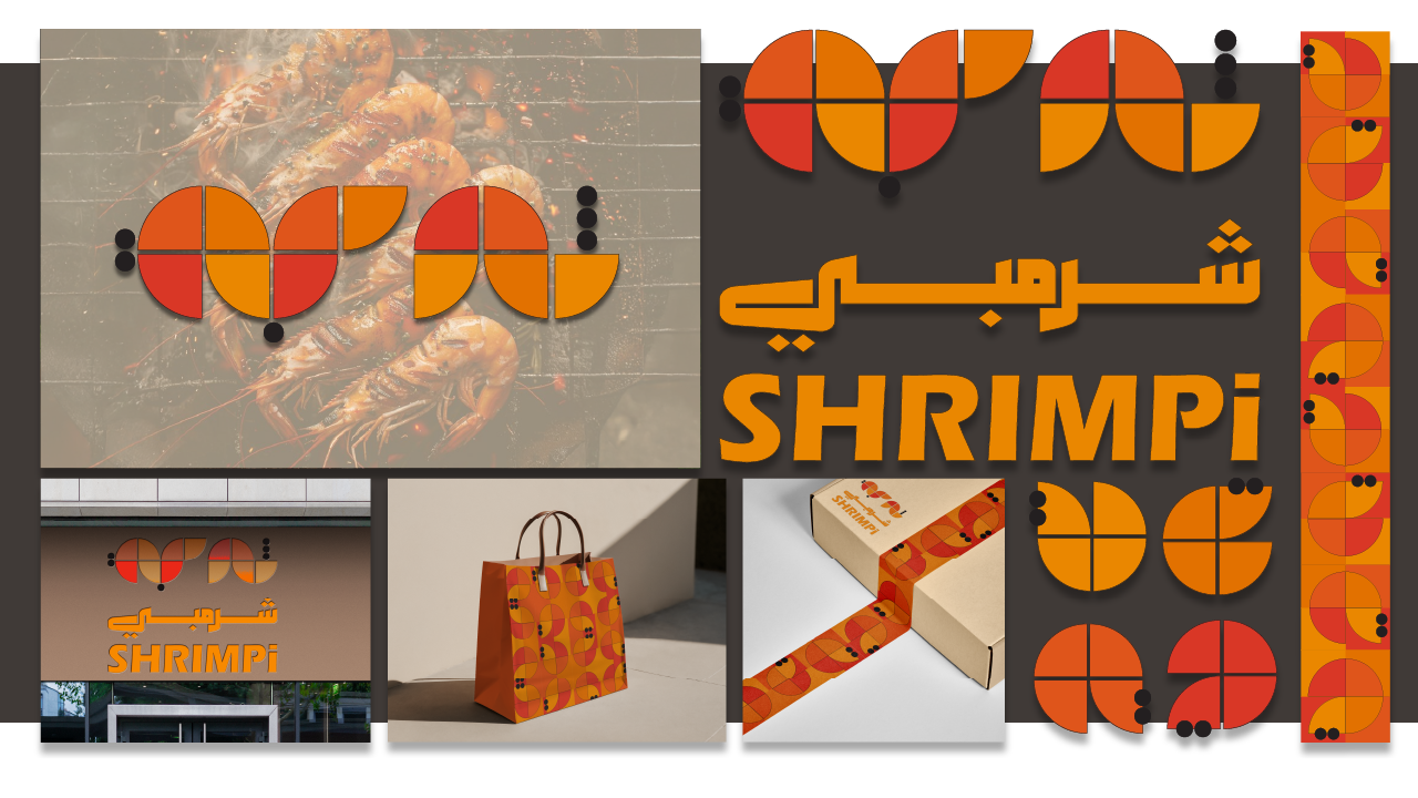
(A bold and playful seafood brand focused on shrimp)
The visual identity of SHRIMPI combines vibrant energy and modern minimalism. Built around geometric, rounded shapes that abstractly resemble shrimp, the brand exudes a youthful and flavorful spirit aligned with its culinary offerings.
What does the visual identity include?
Logo:
The logo features circular modular shapes that form an iconic shrimp-inspired mark. It’s paired with a bold bilingual wordmark in Arabic and English that strengthens brand recognition and communicates a playful, contemporary tone.
Colors:
A warm and spicy palette captures the taste and heat of seafood cuisine:
EA8700 – Bright orange for vibrancy
E27100 – Deep orange for warmth
DF551B – Fiery red-orange for energy
D93726 – Reddish shrimp tone to evoke appetite
These colors create a strong emotional and sensory link with the product.
Typography:
Arabic Fonts: Makin and Hassan Beirut, selected for their boldness and clarity, offering a modern yet accessible feel.
English Fonts: Eras ITC family in four weights (Light, Medium, Demi, Bold) provides a rounded, friendly typeface that complements the soft geometry of the logo.
Patterns & Applications:
A decorative pattern derived from the logo elements is applied to packaging, wrapping, and store visuals to create a cohesive and lively customer experience.
From tote bags to takeaway boxes, the identity brings flavor and design together.
From tote bags to takeaway boxes, the identity brings flavor and design together.
تمثل الهوية البصرية لمطعم شرمبي مزيجًا من الجرأة والمرح، من خلال تصميم فريد مستوحى من أشكال الروبيان (الشرمب) المرسومة باستخدام وحدات هندسية دائرية. تعكس الهوية طابعًا شبابيًا حيويًا يواكب روح المأكولات البحرية العصرية.
ما الذي تشمل الهوية البصرية؟
الشعار:
الشعار يتكون من وحدات هندسية منحنية وبسيطة، تشكّل رمزًا تجريديًا للشرمب بطريقة إبداعية ومميزة. وتحاكي اسم شرمبي بالعربية.
تم دعم الشعار بنسخة نصية باسم "شرمبي" باللغتين العربية والإنجليزية باستخدام خطوط قوية وودية، مما يعزز سهولة التعرّف على العلامة التجارية ويوصل طابعها الجريء.
تم دعم الشعار بنسخة نصية باسم "شرمبي" باللغتين العربية والإنجليزية باستخدام خطوط قوية وودية، مما يعزز سهولة التعرّف على العلامة التجارية ويوصل طابعها الجريء.
الألوان:
تم اختيار لوحة ألوان دافئة مستوحاة من ألوان الشرمب الطبيعي والأجواء البحرية الحارة:
EA8700: برتقالي مشرق يعكس الحيوية.
E27100: برتقالي غامق يعطي دفئًا وحرارة.
DF551B: لون ناري يضفي طاقة وحركة.
D93726: أحمر صدفي يوحي بالنكهة والشهية.
هذه الألوان تخلق مظهرًا جذابًا وشهيًا يناسب مطعمًا متخصصًا في المأكولات البحرية.
الخطوط:
العربية: تم استخدام خطي "مَكين" و "حسن بيروت"، وكلاهما يعكسان شخصية معاصرة وواضحة، مع توازن بين الطابع الشعبي والبساطة.
الإنجليزية: سلسلة خطوط Eras ITC بأربعة أوزان (Light, Medium, Demi, Bold) تم اختيارها لمرونتها وجاذبيتها البصرية، حيث تعطي مظهرًا ناعمًا ومنحنيًا يتناغم مع تصميم الشعار.
الأنماط والتطبيقات:
تم تطوير نمط زخرفي من عناصر الشعار لاستخدامه في التعبئة، الأكياس، والتغليف، ما يعزز من حضور العلامة ويجعلها سهلة التمييز.
تُظهر التطبيقات العملية (مثل الشريط اللاصق، الأكياس، الواجهات) كيف يمكن للهوية أن تعيش بصريًا في تفاصيل تجربة العميل اليومية.