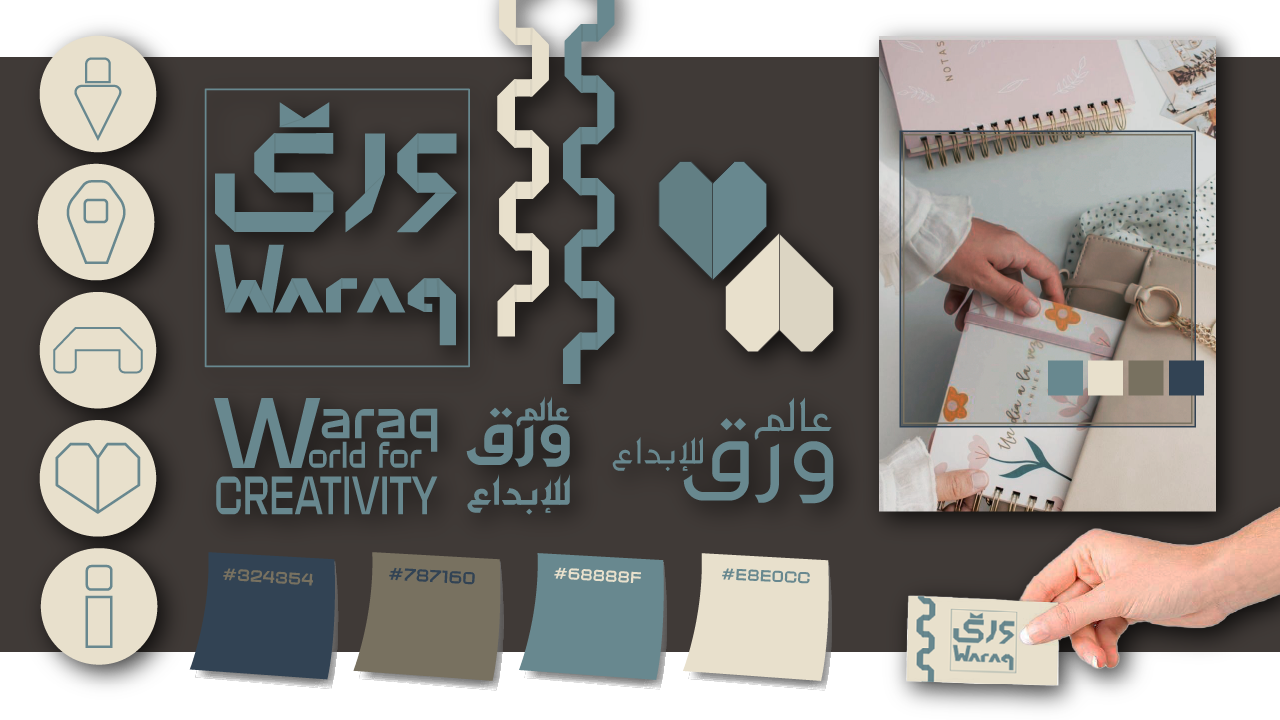
The visual identity of the "Waraq" project represents a set of integrated visual elements that reflect the essence and objectives of the project.
This identity is designed using warm, calm colors, along with simple geometric shapes that carry the folds of paper, with a focus on craftsmanship and creativity.
The visual identity aims to express creativity and professionalism in the field of design and paper production, making it ideal for the stationery and educational sector.
What does the visual identity include?
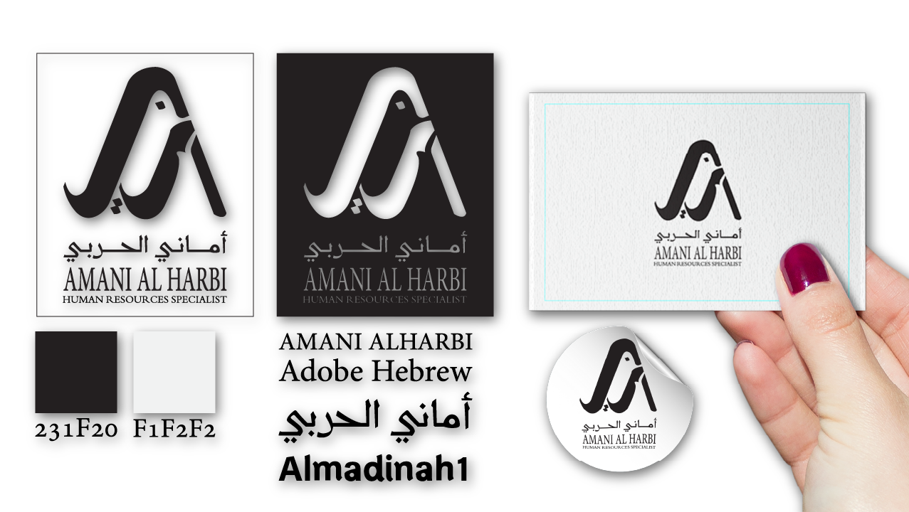
Logo:
The logo consists of two letters with geometric shapes inspired by paper, adding an artistic and contemporary touch to the project. The logo reflects simplicity and modernity, enhancing the brand's image as a professional entity in the stationery and creative design fields.
Colors:
Primary colors such as dark blue and light beige are chosen to represent purity, professionalism, and innovation. Secondary colors like dark green and gray are used to enhance the sense of sustainability and reliability.
These colors reflect sustainability and balance between aesthetic effectiveness and functionality, making them suitable for various designs and materials.
Typography:
Modern and clear fonts are selected to write the project name "Waraq" and the word "Creativity," maintaining consistency and balance between Arabic and English fonts.
Icons and Patterns:
The visual identity includes distinctive icons such as paper folds and origami hearts, representing the paper art associated with the project's name. These icons enhance the brand's visual concept as a specialist in paper design and creativity.
Geometric patterns like squares and triangles add a touch of organization and modernity, reflecting the intellectual infrastructure of the brand.
Complementary Elements:
Circular icons are used for highlighting social media profiles and indicating content within each highlight in a way that aligns with the visual identity style of the "Waraq" project, creating a strong connection between the profiles and the design.
Photography Filters:
A cool filter is applied based on the principles of the visual identity colors to create a harmonious atmosphere for the photographs, ensuring they align with the visual identity of the project.
The Identity Reflected by the "Waraq" Project:
Professionalism: Dominant colors like dark blue and light beige convey strength and balance, reflecting a professional image of the brand.
Creativity: Unique geometric shapes and patterns represent individuality and creativity, reflecting the "Waraq" project's ability to deliver innovative, high-quality products.
Simplicity and Modernity: Clear lines and simple details suggest a modern, minimalist mindset, making the identity adaptable across various fields while maintaining its strength.
Sustainability: Secondary colors like green and gray reflect a commitment to sustainability and environmental care in product design.
Conclusion:
The visual identity of the "Waraq" project is a blend of modernity, simplicity, and creativity, making it perfect for the stationery and educational sectors. This identity represents the project's value in providing innovative, high-quality paper products, establishing a strong connection between customers and the brand.
الهوية البصرية لمشروع "ورق" تمثل مجموعة من العناصر البصرية المتكاملة التي تعكس جوهر وأهداف المشروع.
تم تصميم هذه الهوية باستخدام ألوان دافئة وهادئة، إلى جانب أشكال هندسية بسيطة تحمل طيات الورق، مع التركيز على الحرفية والإبداع.
تسعى الهوية البصرية إلى التعبير عن الإبداع والاحترافية في مجال التصميم والإنتاج الورقي، مما يجعلها مثالية لقطاع القرطاسية والتعليم.
ما الذي تشمل الهوية البصرية؟
الشعار:
الشعار يتكون من حرفين مع أشكال هندسية مستوحاة من الورق، مما يضفي لمسة فنية ومعاصرة للمشروع. الشعار يعكس البساطة والحداثة، ويعزز من رؤية العلامة التجارية كعلامة مهنية في مجال القرطاسية والإبداع.
الألوان:
تم اختيار الألوان الأساسية مثل الأزرق الداكن و البيج الفاتح لتمثل النقاء، الاحترافية، والابتكار. كما تم استخدام الألوان الفرعية مثل الأخضر الداكن و الرمادي لتعزيز الإحساس بالاستدامة والموثوقية.
هذه الألوان تعكس الاستدامة والتوازن بين الفاعلية الجمالية والوظيفية، مما يتناسب مع مختلف أنواع التصاميم والمواد.
الخطوط:
تم اختيار خطوط حديثة وواضحة لكتابة اسم المشروع "ورق" وكلمة "Creativity"، مع الحفاظ على تناسق وتوازن بين الخطوط العربية والإنجليزية.
الأيقونات والأنماط:
تضم الهوية البصرية أيقونات مميزة مثل طي الورق وقلب الاوريقامي، تمثل الفن الورقي المرتبط باسم المشروع. هذه الأيقونات تعزز الفكرة البصرية للعلامة التجارية كعلامة مختصة بالتصميم الورقي والإبداع.
الأنماط الهندسية مثل المربعات والمثلثات تضيف لمسة من التنظيم والحداثة، مما يعكس البنية التحتية الفكرية للعلامة التجارية.
الصور والعناصر التكميلية:
تُستخدم الايقونات الدائرية لهايلايت حسابات التواصل الاجتماعي وللإشارة الى محتوى كل هايلايت بطريقة تواكب اسلوب الهوية البصرية لمشروع ورق، مما يخلق علاقة قوية بين البروفايلات والتصميم.
فلاتر الصور الفوتوغرافية:
تم اعتماد فلتر بارد بأسس تعتمد على ألوان الهوية البصرية لخلق جو متوافق للصور الفوتوغرافية تتناسب مع الهوية البصرية.
الهوية التي يعكسها مشروع "ورق":
الاحترافية: تُظهر الألوان المهيمنة مثل الأزرق الداكن والبيج الفاتح القوة والتوازن، مما يعكس صورة مهنية للعلامة التجارية.
الإبداع: الأشكال الهندسية والأنماط الفريدة تمثل التفرد والإبداع الذي يميز مشروع "ورق"، ويعكس القدرة على تقديم منتجات مبتكرة وعالية الجودة.
البساطة والحداثة: الخطوط الواضحة والتفاصيل البسيطة توحي بفكر عصري وبسيط، مما يجعل الهوية قابلة للتطبيق في عدة مجالات مع الحفاظ على قوتها.
الاستدامة: الألوان الفرعية مثل الأخضر والرمادي تعكس التوجه نحو الاستدامة والعناية بالبيئة في تصميم المنتجات.
الخلاصة:
الهوية البصرية لمشروع "ورق" هي مزيج من الحداثة، البساطة، والإبداع، مما يجعلها مثالية لمجال القرطاسية والتعليم. تمثل هذه الهوية قيمة المشروع في توفير منتجات ورقية مبتكرة وبجودة عالية، مما يخلق اتصالاً قويًا بين العملاء والعلامة التجارية.