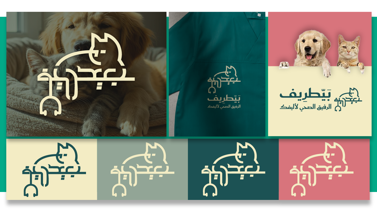
Baytareef | Logo & Visual Identity
Field of Work:
Veterinary clinic and pet care supplies store.
Veterinary clinic and pet care supplies store.
Name Concept:
The name "Baytareef" is derived from merging two Arabic words:
"Baytari" (Veterinary) + "Aleef" (Pet) = Baytareef
The name reflects the combination of professional veterinary care with the warmth and affection that bonds people with their beloved pets — simple, memorable, and friendly.
The name "Baytareef" is derived from merging two Arabic words:
"Baytari" (Veterinary) + "Aleef" (Pet) = Baytareef
The name reflects the combination of professional veterinary care with the warmth and affection that bonds people with their beloved pets — simple, memorable, and friendly.
Logo Concept:
The logo is inspired by the most common pet in Saudi Arabia — the cat, illustrated in a relaxed and comfortable pose to symbolize trust and reassurance.
This visual is cleverly integrated with a stethoscope, representing medical care and attention.
The brand name is written in a well-balanced and friendly font, supporting the message of personalized and heartfelt care.
Color Palette:
The chosen colors reflect trust, calmness, and a sense of comfort for both pets and their owners:
The chosen colors reflect trust, calmness, and a sense of comfort for both pets and their owners:
#D8747C (Warm Earthy Pink)
#1C5254 (Deep Olive Green)
#92A596 (Soft Sage Green)
#F3ECC4 (Light Ivory Beige)
Typography:
Saudi Font for both Arabic and English.
The font was selected for its high readability and modern yet friendly appearance, perfectly aligning with the brand’s identity.
The font was selected for its high readability and modern yet friendly appearance, perfectly aligning with the brand’s identity.
Visual Identity:
Primary and vertical logo designs.
Color systems and various application options.
Supporting graphic elements like pet paw icons.
Brand implementation across medical uniforms, storefront signage, labels, and social media platforms.
Identity Objective:
To position Baytareef as a place that offers specialized veterinary care with love and dedication — a space where pets feel safe and comfortable, and their owners feel confident and reassured.
To position Baytareef as a place that offers specialized veterinary care with love and dedication — a space where pets feel safe and comfortable, and their owners feel confident and reassured.
بيّطرِيف | شعار وهوية بصرية
مجال العمل:
عيادة بيطرية ومتجر مستلزمات وعناية للحيوانات الأليفة.
عيادة بيطرية ومتجر مستلزمات وعناية للحيوانات الأليفة.
فكرة الاسم:
الاسم "بيّطرِيف" هو دمج بين كلمتي:
"بيطري" + "أليف" = بيّطرِيف
ليعبّر عن الرعاية الصحية البيطرية مع لمسة الألفة والود التي تجمع الإنسان بحيوانه الأليف، بأسلوب بسيط وسهل التذكر.
الاسم "بيّطرِيف" هو دمج بين كلمتي:
"بيطري" + "أليف" = بيّطرِيف
ليعبّر عن الرعاية الصحية البيطرية مع لمسة الألفة والود التي تجمع الإنسان بحيوانه الأليف، بأسلوب بسيط وسهل التذكر.
فكرة الشعار:
الشعار مستوحى من أكثر الحيوانات الأليفة شيوعًا في السعودية، القطة، وهي في وضعية استرخاء وراحة — تعبيرًا عن الثقة والاطمئنان.
تم دمج هذا العنصر مع سماعة الطبيب داخل التصميم، كرمز للرعاية الصحية والاهتمام.
الاسم مكتوب بخط متوازن وودي يعزز رسالة المشروع في تقديم رعاية صحية بإحساس شخصي ودافئ.
الشعار مستوحى من أكثر الحيوانات الأليفة شيوعًا في السعودية، القطة، وهي في وضعية استرخاء وراحة — تعبيرًا عن الثقة والاطمئنان.
تم دمج هذا العنصر مع سماعة الطبيب داخل التصميم، كرمز للرعاية الصحية والاهتمام.
الاسم مكتوب بخط متوازن وودي يعزز رسالة المشروع في تقديم رعاية صحية بإحساس شخصي ودافئ.
الألوان:
اختيار ألوان تعكس الثقة، الهدوء، والراحة النفسية للحيوانات وأصحابها:
اختيار ألوان تعكس الثقة، الهدوء، والراحة النفسية للحيوانات وأصحابها:
#D8747C (وردي ترابي دافئ)
#1C5254 (أخضر زيتي عميق)
#92A596 (أخضر رمادي هادئ)
#F3ECC4 (عاجي فاتح مريح)
الخط المستخدم:
Saudi Font للعربية والإنجليزية.
تم اختيار الخط لتحقيق وضوح عالٍ وقراءة سهلة مع الحفاظ على طابع عصري وودود يتناسب مع هوية المشروع.
تم اختيار الخط لتحقيق وضوح عالٍ وقراءة سهلة مع الحفاظ على طابع عصري وودود يتناسب مع هوية المشروع.
الهوية البصرية:
تصميم الشعار الأساسي والرأسي.
أنظمة الألوان وخيارات التطبيقات المتنوعة.
أيقونات البصمة الحيوانية كعناصر داعمة للهوية.
تطبيق الهوية على الملابس الطبية، الواجهات، الملصقات، ومنصات التواصل.
الهدف من الهوية:
إبراز بيّطرِيف كمكان يقدم الرعاية الصحية المتخصصة بحب واهتمام، في بيئة تشعر فيها الحيوانات الأليفة بالأمان والراحة، ويشعر أصحابها بالثقة والاطمئنان.
إبراز بيّطرِيف كمكان يقدم الرعاية الصحية المتخصصة بحب واهتمام، في بيئة تشعر فيها الحيوانات الأليفة بالأمان والراحة، ويشعر أصحابها بالثقة والاطمئنان.