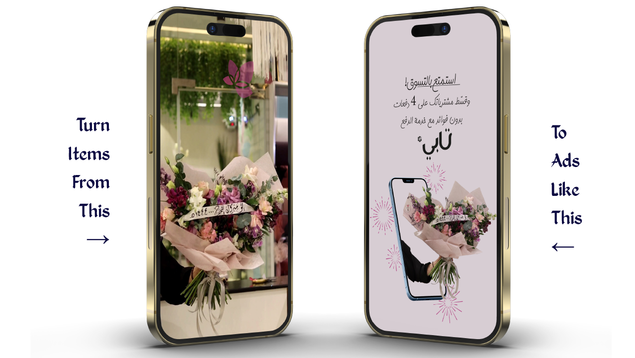

The "Al Sayyaf" project aims to develop a comprehensive visual identity that reflects authenticity and luxury while highlighting its Saudi roots by blending Hejazi heritage with modern touches. The primary color, dark green, was chosen to represent growth and authenticity as it symbolizes the Saudi national identity, accompanied by rich earthy tones that enhance the sense of elegance and sophistication. The work encompassed the design of the logo, color palette, typography, and decorative patterns to ensure a consistent visual experience that showcases the product quality and the brand’s uniqueness, maintaining a distinguished market presence that leaves a lasting impression on customers.
What does the visual identity include?
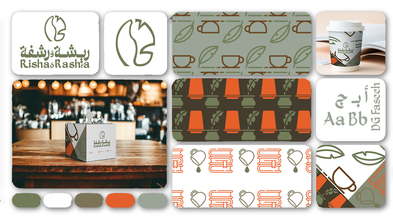
Logo:
The logo features a distinctive icon inspired by the falcon, symbolizing strength, luxury, and rarity, combined with traditional patterns derived from Hejazi rawasheen to reflect the project's cultural roots. It embodies the brand’s message of blending authenticity with modernity and highlights core values such as quality, excellence, and cultural connection.
Colors:
The primary color palette incorporates rich shades of dark green to convey elegance and strength while emphasizing Saudi identity, growth, and sustainability. Complementing the primary color, white represents purity and simplicity, creating a balanced visual contrast between tradition and modernity. Subtle gray tones serve as secondary colors, adding a professional and refined touch while maintaining the connection to cultural elements. This color combination creates a warm and inviting atmosphere, reflecting the premium quality of the products and the brand’s luxurious nature.
Typography:
The Arabic typeface draws inspiration from Hejazi calligraphy, emphasizing the brand’s authenticity and providing a distinctive local character. For the English content, modern and legible fonts were selected to ensure readability and maintain a cohesive identity across both languages. The chosen typography strikes a balance between professionalism and modernity, giving the visual identity an elegant and contemporary appeal.
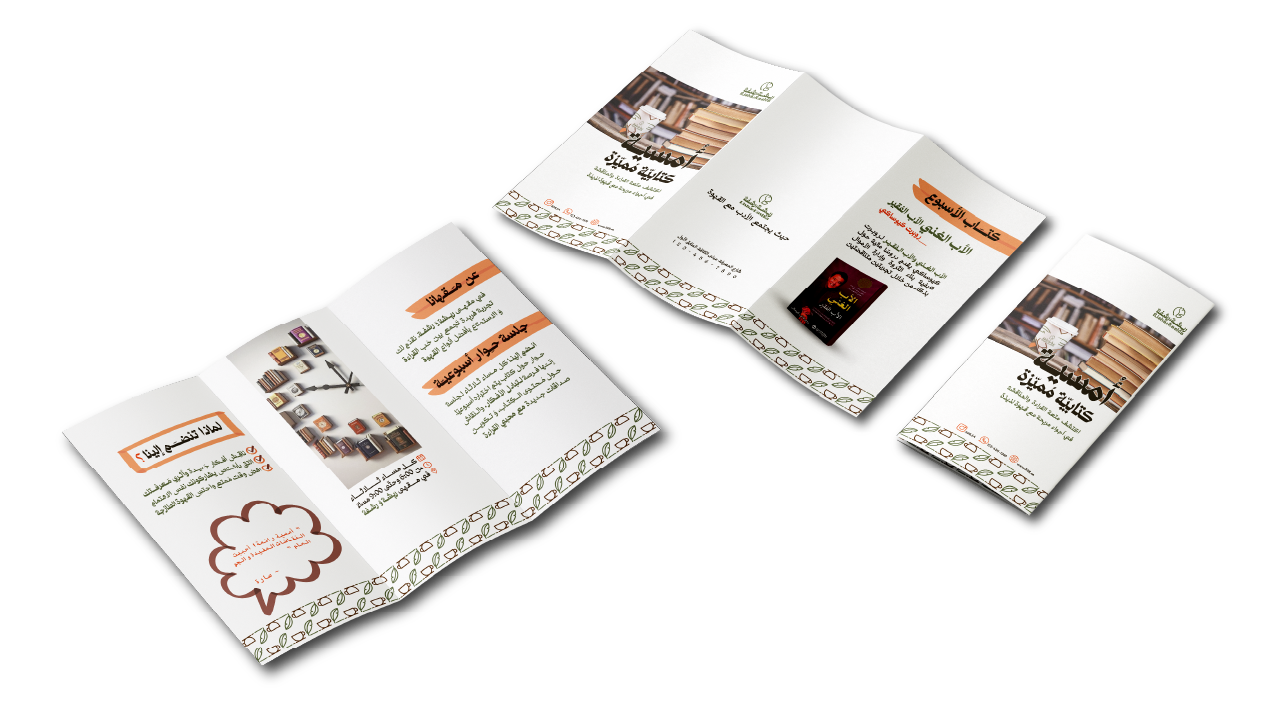
Patterns and Complementary Elements:
The visual identity includes decorative patterns inspired by traditional Hejazi motifs, used to add aesthetic value to various applications without compromising brand clarity. These patterns are integrated into printed materials, packaging, and backgrounds, enhancing the customer experience and providing a modern representation of cultural heritage.
Imagery and Supporting Visuals:
High-quality images of the products and workspace are used to showcase the intricate details of the luxury perfumes, highlighting craftsmanship and precision. Each image is carefully selected to align with the visual identity’s colors and lighting, reinforcing the overall brand atmosphere and improving the customer’s interaction at every touchpoint.
Conclusion:
The visual identity of "Al Sayyaf" strikes a harmonious balance between authenticity, luxury, and modernity. It seamlessly combines heritage-inspired elements from Hejazi culture with contemporary design choices tailored to modern market needs. The use of green not only reinforces Saudi national identity but also symbolizes growth and sustainability. This identity aims to represent high-quality aromatic products through a refined visual experience that leaves a strong and lasting impression on customers.
يهدف مشروع "السيَّاف" إلى تطوير هوية بصرية متكاملة تعكس الأصالة والفخامة مع إبراز الجذور السعودية من خلال دمج التراث الحجازي بلمسات عصرية. تم اختيار اللون الأخضر ليُعبّر عن النمو والأصالة كونه رمزًا للهوية الوطنية السعودية، إلى جانب ألوان أرضية داكنة تعزز إحساس الفخامة والرقي. شمل العمل تصميم الشعار، الألوان، الخطوط، والأنماط الزخرفية لضمان تجربة بصرية متسقة تُبرز جودة المنتجات وتفرد العلامة التجارية، مع الحفاظ على حضور مميز في السوق يترك انطباعًا دائمًا لدى العملاء.
ما الذي تشمل الهوية البصرية؟
الشعار:
الشعار يتكون من أيقونة مميزة مستوحاة من الصقر، الذي يُمثل القوة، الفخامة، والندرة، مع دمج النقوش التقليدية المستوحاة من الرواشين الحجازية لتعكس الجذور الثقافية للمشروع. يُجسد الشعار رسالة المشروع في الجمع بين الأصالة والحداثة، ويعكس القيم الأساسية للعلامة التجارية مثل الجودة، التميز، والارتباط بالتراث.
الألوان:
تم اختيار الألوان الأساسية من الظلال الغنية مثل الأخضر الداكن ليُعبّر عن الفخامة والقوة، إلى جانب رمزيته في عكس الهوية السعودية والارتباط بالنمو والاستدامة، بينما يُعبر اللون الأبيض عن النقاء والبساطة، مما يخلق توازنًا بصريًا بين العراقة والحداثة. الألوان الفرعية بدرجات الرمادي الهادئة تضيف إحساسًا بالاحترافية والرقي، مع الحفاظ على ارتباط الهوية بالعناصر الثقافية التقليدية. تساهم هذه الألوان في خلق جو دافئ وترحيبي، يعكس جودة المنتجات وفخامة العلامة التجارية.
الخطوط:
تم استخدام الخط العربي المستوحى من الطابع الحجازي، ما يعكس أصالة العلامة التجارية ويمنحها طابعًا محليًا مميزًا. أما في المحتوى الإنجليزي، فتم اختيار خطوط حديثة وواضحة لضمان سهولة القراءة وتناسق الهوية عبر اللغات المختلفة. الخطوط المستخدمة توازن بين الاحترافية والحداثة، ما يمنح الهوية مظهرًا أنيقًا وعصريًا.
الأنماط والعناصر التكميلية:
تتضمن الهوية أنماطًا زخرفية مستوحاة من النقوش الحجازية التقليدية، تُستخدم لإضافة لمسة جمالية على التطبيقات المختلفة دون التأثير على وضوح الهوية. تم دمج هذه الأنماط بخلفيات المواد المطبوعة والتعبئة والتغليف، مما يعزز تجربة العملاء ويعكس التراث الثقافي للمشروع بشكل عصري.
الصور والعناصر الداعمة:
تُستخدم صور للمنتجات وبيئة العمل لعرض تفاصيل العطور الفاخرة، مع إبراز الحرفية والدقة في كل منتج. يتم اختيار الصور بعناية لضمان اتساقها مع الهوية البصرية من حيث الألوان والإضاءة، مما يعكس الجو العام للعلامة التجارية ويُحسن من تجربة المستخدم في جميع نقاط الاتصال.
الخلاصة:
الهوية البصرية لمشروع "السيَّاف" هي مزيج متوازن من الأصالة، الفخامة، والحداثة. تجمع بين العناصر التراثية المستوحاة من الثقافة الحجازية واللمسات العصرية التي تواكب احتياجات السوق الحديث، مع إبراز الهوية السعودية من خلال اللون الأخضر الدال على النمو والانتماء الوطني. تهدف هذه الهوية إلى تقديم منتجات عطرية فاخرة تتميز بالجودة، مع توفير تجربة بصرية تترك انطباعًا قويًا ومستدامًا لدى العملاء.